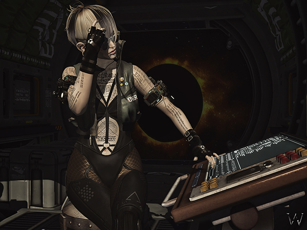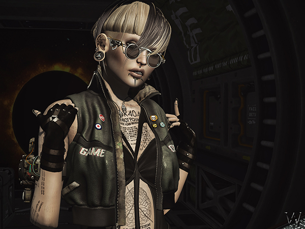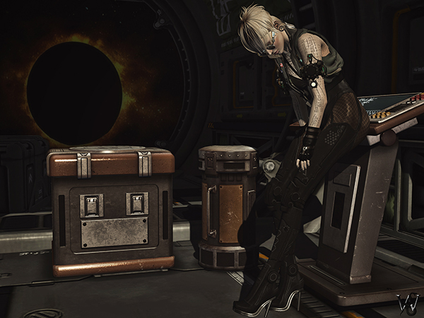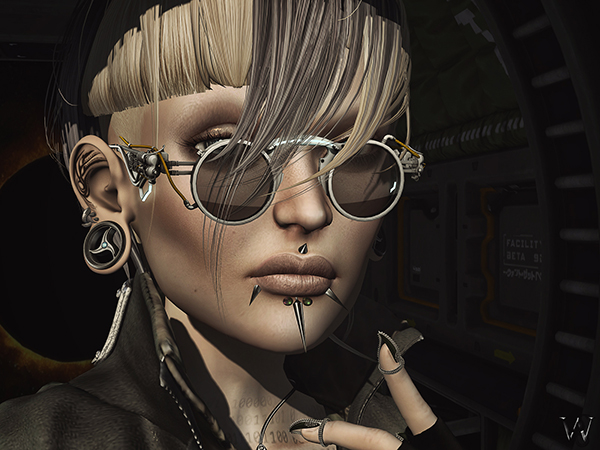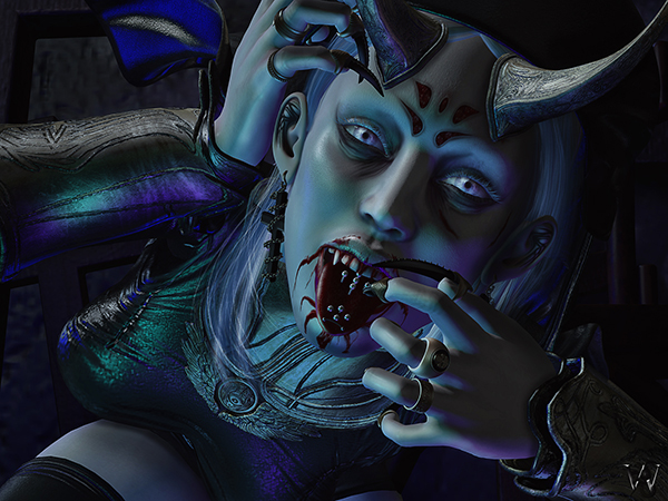
It is still sunny and hot outside but I already desire the dark months again… maybe exactly because of that. I hate hot weather and I never was a huge friend of the sun.
Recently I watched the movie “The Nun” again. I do love mystic, horror movies a lot and the 2 Conjuring movies with the spin-offs of Anabelle and The Nun are just a must if you love that kind of genre 😉
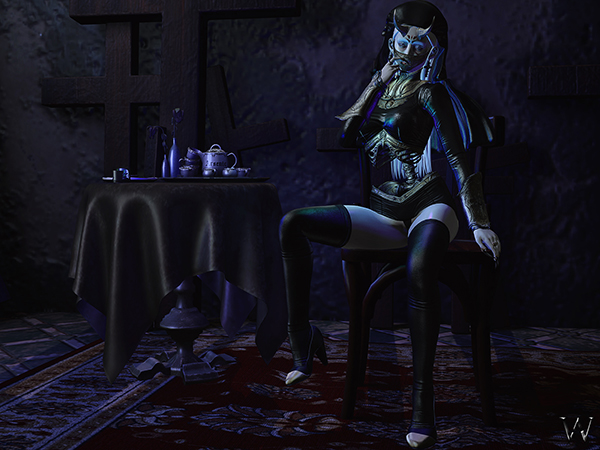
So I guess The Nun was my inspiration for this when I saw the “Lost Saints ” gacha from ANTINATURAL[+] the first time. Like usual it took me a while before I found all my components and parts for my pictures, but I got used to that. I have a huge respect for those who get something at the release day and instantly have a cool idea what they could do with it for their pictures. I am not talking about the usual blogger pictures that are just showcasing the outfits (nothing wrong with them), but about those who make pictures that kinda tell stories or being made in an artistic way.
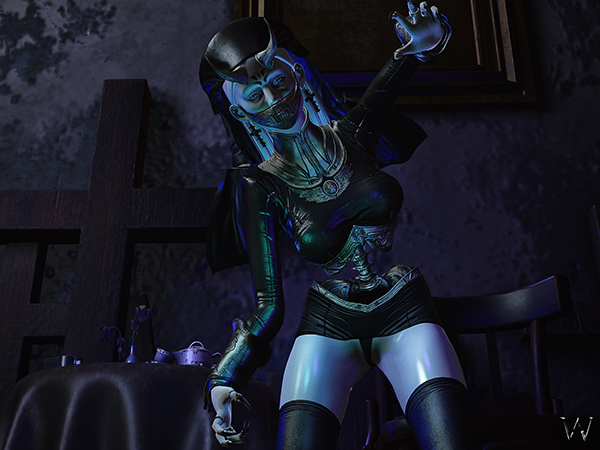
I remember times when I just blogged for blogging purposes like reviews, showcasing items, putting a simple stylecard and doing promotion for designers. Like I said before there is nothing wrong with that, but after 10 years of blogging I had to find something different for me as blogging started to feel like a duty only and the fun started to vanish. I started originally with one picture and a style card and never had more than one or two sentences to it. Back then it was cool as I could kinda pump out up to 7 posts per day. Back then we didn’t have any kind of windlight, shadows or meshes, so it was way more easy to shoot pictures and post process them lightly. Usually the only thing I did was to put me in front of a colored background, have more than one view of myself or closeups in the picture and in the end I added a shadow to give it at least some depth (EXAMPLE). Back then I felt really cool with doing that, as it did it’s purpose to showcase designers work as best as I could. Those damn shadows and the desire to have myself more than once on my pictures or have some closeups were the reason why I started to learn Photoshop back then *giggles*
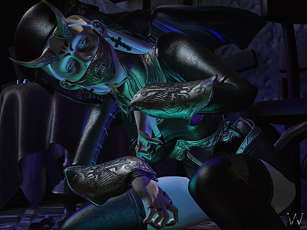
Over the time I tried various things to develop my picture skills and to find new ways how I could showcase designers work properly. I tried simple backgrounds, busy ones and I tried the green-screening and having completely different backgrounds that did not came from Second Life. The last one I did not try for too long as it did not look right for me and I really wanted to keep my pictures taken in SL. I never had the desire to merge SL snapshots into RL pictures or backgrounds and so I gave up on that trend relatively quick. While I started with square pictures (512×512) I figured out fast, that other rations can look way more interesting and attractive. After experimenting quite a while with sizes and formats, I found out that I do love 4:3 (3:4 as well) ratio the most.
Back in 2009, blogging wasn’t as popular as it is today and as a model we were told we should do pictures of have a blog to showcase our styling skills away from the runway shows and vendor shots where the designers kinda put their own visions on us. It was a way to interpret clothing different than the designer initially did, but still it was a way to promote the designs and show that they could have different ways of styles and could attract different groups of people. I had the most fun to fool around with gowns, away from being just beautiful and pretty *grins*
First I was told if I keep on doing such things, like wearing gowns with shaved hair and piercings, pull simple casual outfits to something wicked and dark with accessories and the location/set I was using, mix and match different outfits together or even use accessories away from their original purpose, I would damage my reputation and no one ever would give me things to blog anymore. I was new into the business back then and a little scared that those who already worked in the fashion industry would be right. So I calmed down again and went on with mainstream pictures again. Then something really funny happened. Designers, fellow models and some other people IMed me asking me why I would go back to those “boring” styles again. That was a wakeup call for me. Even if my ideas were unconventional and different, there were some people who enjoyed that as much as I do. I screwed the thought and the anxiety about my weird ideas and went back to what I really enjoyed. But I always made sure to not distort designers work with too weird poses and later on, when we got windlight, shadows and lights, to not change the color of an outfit or have things too dark so you could not anymore see them. I wanted to have more than one picture, so that I could tell a little story with them. To the same time it would give me the possibility to again focus on details in different pictures. I made the decision to put more pictures on my blog post and have one reference picture (mostly the one I loved the most) displayed on Flickr. That all kept my pictures weird for my styles but in general relatively simple, as they looked flat without any emotion and depth. For quite a while that was ok for me and I enjoyed, that I could live my craziness of styles and got new sponsors now and then (EXAMPLE).
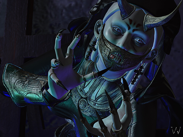
Again I came across a point where I had the desire to change something as I wanted to have more emotions and feelings in my pictures. When we got windlight, shadows and lights, I found out that you can create cool, dramatic shots with a strong light and shadow combination and a powerful windlight. But there was the other side of the coin… with deep shadows some details started to vanish and first I had the feeling I should not do that as it does hide designers work too much. The more I tried, the less I could resist to all those new features and I that seriously put me on the horns of a dilemma. I wanted to do more artistic pictures that have more content than just the clothing that I was wearing, but how I could do that if I loose details to the dark. When bento came to Second Life it was even worse, as pose creators started to make more crazy poses and with my 4:3 ratio pictures I didn’t want to use standing poses only anymore where I had more background than avatar on the picture. I had so many awesome sponsors (if I now look back, it were too many) and I wanted to satisfy them all. I wasn’t able to have a combination of blog pictures and personal pictures done, as I had so many deadlines and outfits that I had to blog. There was a point where everything became too much and blogging or making pictures became a burden and nearly all the fun had vanished. I had to make a decision – either I go on like usual and loose all my interest in blogging, Second Life and everything I loved, or I have to change something drastically and revamp my blog.
It wasn’t an easy decision as I had the feeling I do have to let my sponsors go, when I cannot satisfy them anymore. I left a few and as well explained to them why I had to. A handful of my sponsors really surprised me, when they told me they would still like to keep me and see where my journey would go to – I never ever expected that!
I took a few weeks off and started to reconsider my blog and pictures. During that time I watched a lot of Photoshop tutorials and learned a lot of new techniques about photo editing. When I came back I was full of energy and started to play with lights, projectors and shadows and experimented with all the new things I learned in Photoshop. It was a complete new freedom and feeling and I found all the fun back, that I missed so much. I am a very self-critical person and so even if the fun was back I felt there was missing something, as many times the pictures looked ok but not “cool”. That was when Silly told me about VISONAIRE. First I thought, why I should take a course if I can have all the tutorials and information on the Internet as well? But the more I thought about the more I did remember, how much I loved attending classes and workshops in my life. So I signed up and I have to tell you, I do not regret any second! (If you want to know more about my VISIONAIRE experience you can look HERE) It was a completely different experience and it did teach me a lot about things that I never thought of and just did because I felt it looks nice. What was again a huge surprise, with my new way of pictures (I did not dare to apply as a blogger at too many places anymore) I got requested as a blogger or even got flickr mails where designers or blogger managers invited me to join their blogger team. That certainly was the most awesome thing that could happen – I do what I enjoy and others do enjoy my new way of blogging too!
I am sure, there will be times, when the desire of changes will come up again, but for now I really do enjoy blogging and taking pictures again 🙂
Clothing
Outfit: ANTINATURAL[+] – “Lost Saints / Unsainted Nun / Mini” (Gacha, Rare)
Veil: ANTINATURAL[+] – “Lost Saints / Unsainted Nun / Veil” (Gacha, Rare)
Shoes: ANTINATURAL[+] – “Lost Saints / Leather Boots” (Gacha, Rare)
Accessories
Wrist Armor: ANTINATURAL[+] – “Lost Saints / Gold Gauntlets” (Gacha, Rare)
Tounge Piercings: LeLutka – “BDYART-TBRBL” (Bento)
Headpiece: ANTINATURAL[+] – “Lost Saints / Sacred Silence / Gold” (Gacha, Common)
Horns: ANTINATURAL[+] – “Lost Saints / Gilded Horns / Gold” (Gacha, Common)
Rings: .:E.A.Studio:. – “Tunderstrike Rings” (Maitreya, Bento)
Nails: .:E.A.Studio:. – “Obsess Claws” (Maitreya, Bento)
Hair & Makeup
Hair: Entwined – “Jana”
Eyemakeup: CURELESS[+] – “Undereye Lines & Eyeliner” (Omega Applier)
Forehead: CURELESS[+] – “Onibi Markings” (Omega Applier)
Wounds: .{PSYCHO:Byts}. – “Badass Fighter” (Omega Applier)
Lips: LeLutka – “Beast Applier” (LeLutka Applier)
Body & Tattoo
Head: LeLutka – “Korina 3.3” (Bento)
Teeth: LeLutka – “Beast Teeth 1.1” (Bento)
Body: Maitreya – “Lara 4.1” (Bento)
Skin: *YS&YS* – “Immortal Skin” (LeLutka & Maitreya Applier)
Eyes: ANATOMY – “Reflect Eyes – Albino”
Ears: .:E.A.Studio:. – “Gormory Ears”
Poses & Props
Poses: Poseidon – “Evil Nurse”, “Puppeteer”, “Hil Nurse” & “Morgue”
Background: SEMPITERNAL – “[The Forbidden Room]”
Table & Dishes: DRD – “Black Widow Tea Table”
Model & Photographer

