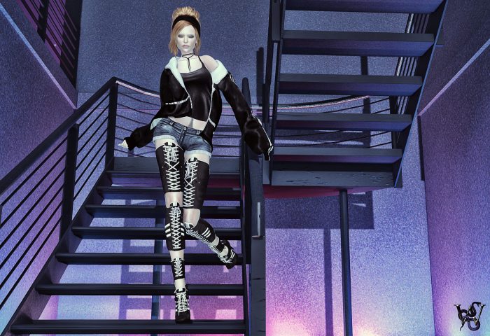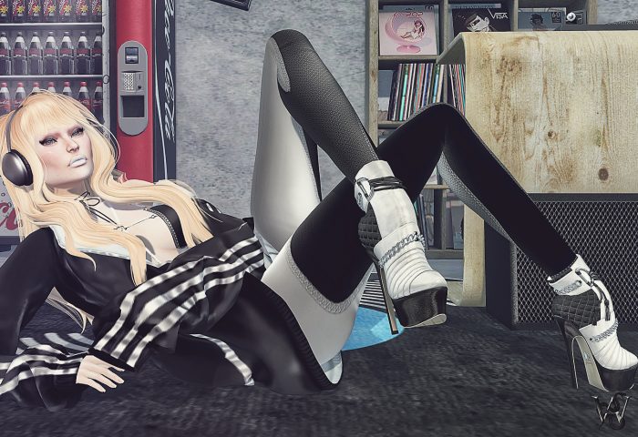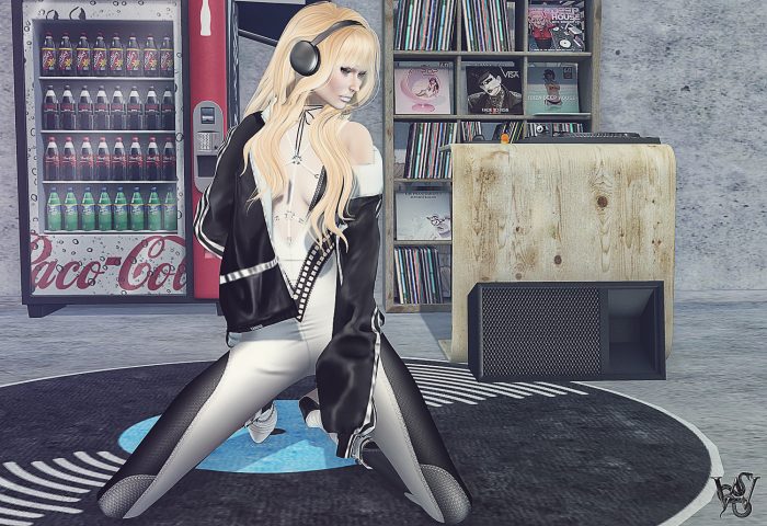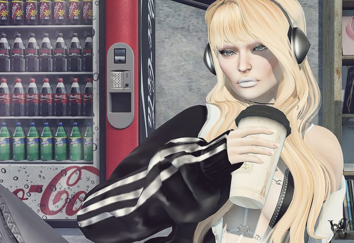
Lately I got really frustrated about picture composition and why sometimes things work and if you try to do the same thing exactly as before it won’t work anymore.
Did you ever come across such as well?
You know you have the basic rules for picture composition down, you do as you learned over years how to align things and items and set your avatar in place and still you miss the “wow” on the picture? Then you start playing with lights and shadows, push around prims, add more lights and delete them again, change the angles and anyways what you do always looks ‘ok’ but not that you would like to work on the picture more?
This time I forced myself to work on all of the pictures, anyways if I do like it or not. The purpose was to do a Visionaire homework and I wanted to discover why I feel so different or see different things in pictures. As well to see if all the popular art rules would go over my personal liking in picture composition.
I adore people who know how to place things for sets, it looks so easy and consistent while there is so much thinking behind it. I only can imagine how long you have to play ‘prim nudger’ until you have everything in place for a huge complete scenery. I only do little sets, with a few selected props usually and that already feels like it would take forever. I do not mean to feel like a whiney but I really pulled my hair over that the past weeks and if you have a solution, you are more than welcome to put it in the comments – I would highly appreciate that :).
Now, more about my todays look…
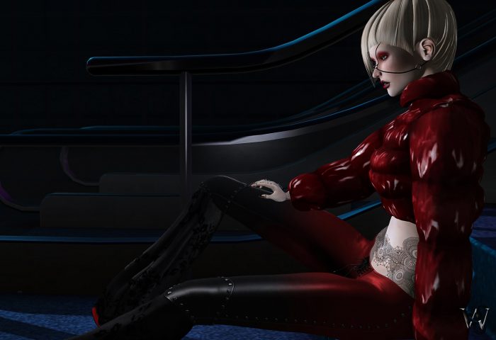
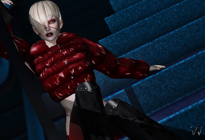
It was time fo contrasts again for me. I went for a black and red look and wanted to combine it with a blue/black background, that I was eying quite a while already and never had any ideas what I could do with it.
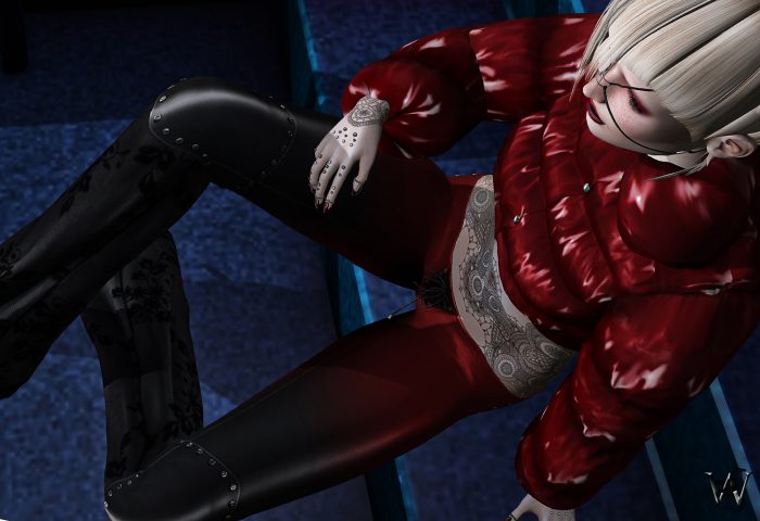
When I saw the “Maggie” pants from Salt & Pepper, I immediately fell in love with them. They do have an amazing color HUD as well, but when I saw the black and red I was sold :p
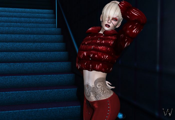
I just had to find a jacket, that goes with the whole idea and that I found in the “Bubble Crop Jacket” made by Sabotage. Since I do have an addiction for tattoos – I always had – The amazing blank belly was able to be tattooed with one of the amazing creations of White Widow.
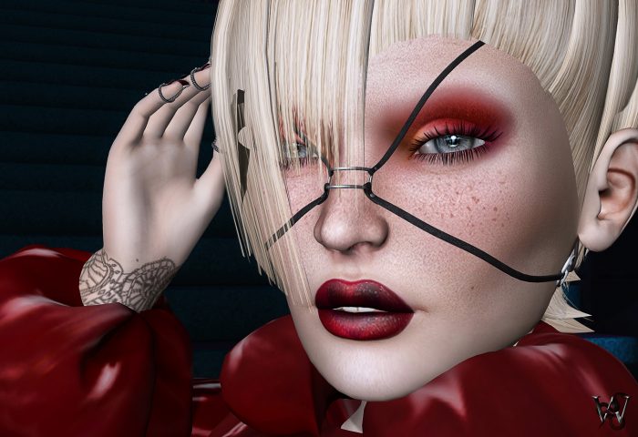
With that strong styling and as well the contrast I chose by using a blue/black background to my red/black style, I needed a strong makeup, too. And yes – you can make a guess – it comes from Zibska :p It is not a secret how much I do love Zib Sgaggs designs and the more I am happy, that I can showcase another amazing Makeup/Lipstick combo named “Ventura”.
I enjoyed playing with artistic rules in mind like ‘Lines & Diagonals’, ‘Repetition or the ‘Rule of Thirds’. For some I even found the Fibonacci sequence applying – can you guess which ones?
Outfit & Accessories
Jacket: ..S.. – “Bubble Crop Jacket – Red” (Maitreya)
Pants: Salt & Pepper (S&P) – “Maggie” (Maitreya)
Shoes: PHEDORA – “Abby Heels” (Maitreya)
Face: +XAnSA+ – “JianDi Face Straps”
Piercings: Meva – “Bento Hand Piercings 2” (Maitreya)
Rings: Meva – “Bento Nails 3” (Maitreya)
Hair & Makeup
Hair: .shi – “Hearken”
Makeup & Lipstick: Zibska – “Ventura” (LeLutka Applier)
Body & Tattoo
Head: LeLutka – “Simone 3.0”
Body: Maitreya – “Lara 4.1”
Face: Izzie’s – “Pores & Blemishes” (LeLutka Applier)
Tattoo: [White~Widow] – “Dead Man” (Maitreya Applier)
Poses & Props
Background: Mesh India – “Bon Voyage Escalator Background”

